I am called Charlotte Joyce and I am currently studying for my A Level in Media. The purpose of my preliminary task is to create a school magazine front cover and contents page, the purpose of this is to show the starting point I am at in creating my front cover and contents page and the skills I will pick up and the improvements I am therefore going to make when creating a front cover and contents page for my final. My School Magazine Front Cover and Contents Page   Pictures I used for my Preliminary Task and Why.
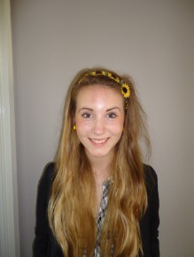
.JPG.opt206x274o0,0s206x274.JPG) I chose this image because it relates to my feature story 'Sixth Form Wear' as it clearly shows to models wearing suits and posing. However I chose this image because the models look like ordinary girl next-door types and are wearing what other pupils usually wear, which means the target audience can relate to them and that therefore attracts the target audience and makes them want to read my magazine. Also it shows variation from the other photos as it shows different models and a different shot (long-shot) However the background of the image is borung and dull and you can see everyones bags. Evaluation. My preliminary task was to create a school magazine front cover and contents page. Based on some comments I received from my class mates and my own ideas, I now know what went well and what can be improved on. The things that went well for my front page were; the variety and choice of my images; good used of conventions; the colour scheme I used and that my layout is clear. However my improvements for my front page are; the 'weekly' part of my title could be clearer and stand out more; there should be more text; the puff should be bigger so it stands out more; the barcode should be smaller as it is too big and I should use a different colour background opposed to white. The things that went well for my contents page were; it had a good clear layout and the colour scheme was good. However the thing i could improve on were; I could have a more professional looking and consistent fonts and I should use a different, more colourful background Personally, taking this all into consideration and some of my own ideas. I believe my main improvements for my next task will be to; use clearer and more professional looking fonts, show continuity with my front cover and contents page and to make them look more professional - with my pictures, font and colour scheme and make sure my magazine attracts a wider range of audience - as at the moment it only attracts female sixth-formers. |
||||||||
|
||||||||
.JPG.opt187x247o0,0s187x247.JPG)
.JPG.opt243x182o0,0s243x182.JPG)
.JPG.opt225x167o0,0s225x167.JPG)

|